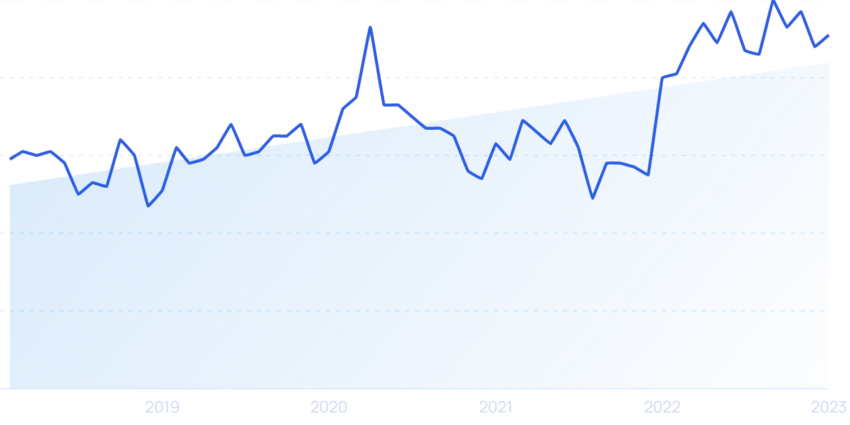
TL;DR Summary of Key Trends Driving the Data Visualization Market Growth
Optimixed’s Overview: Emerging Innovations Shaping the Future of Data Visualization
1. Data Democratization Empowers Broader Access and Creativity
Data democratization removes barriers, allowing employees and citizens alike to explore and visualize data independently. This trend is supported by no-code/low-code platforms such as Opendatasoft and Tableau Public, which simplify data interactions for non-technical users. The widespread adoption of these tools fosters informed decision-making and wider data literacy.
2. Real-Time Data Visualization Drives Competitive Advantage
- Real-time analytics enable organizations to react quickly to operational changes and emerging trends.
- Industries like logistics and aviation leverage live dashboards to optimize tracking and resource management.
- Innovative applications also include accessibility enhancements, such as campus navigation aids for autistic students using sensor data.
3. Animated and Interactive Visualizations Enhance Engagement and Insight
Dynamic visuals tell compelling stories by illustrating data changes over time and enabling user interaction. Modern techniques include 3D zooming and layered animation to improve comprehension. Examples include animated minimum wage trends and interactive climate change maps that invite users to explore detailed datasets.
4. Social Media as a Catalyst for Data Visualization Reach
- Visual content, especially infographics, dominates social sharing and captures attention in fast-scrolling environments.
- Brands like Vox utilize clear, bold visuals to boost engagement and credibility.
- Financial educators harness data visuals on platforms like Instagram to grow audiences and drive revenue.
5. Data Storytelling Combines Narrative and Visualization for Impact
Blending text, data, and images, data storytelling addresses skepticism toward media by presenting transparent, data-driven narratives. Major news outlets use tools like Datawrapper to craft interactive stories that clarify complex issues such as space debris. In business, storytelling turns raw data into actionable insights, making it the preferred method for consuming analytics by 2025.
Conclusion
The increasing volume of data and expanding user base are transforming data visualization from a specialized IT function into a ubiquitous tool for communication, decision-making, and brand building. With advancements in accessibility, real-time capabilities, animation, social media integration, and storytelling, data visualization’s influence is poised to grow substantially in the near future.