TL;DR Summary of Pinterest’s 2026 Color Trends Report: The Top Hues to Drive Engagement
Optimixed’s Overview: Key Color Trends Shaping Visual Engagement on Pinterest in 2026
Understanding Pinterest’s Color Forecast and Its Impact on Content Strategy
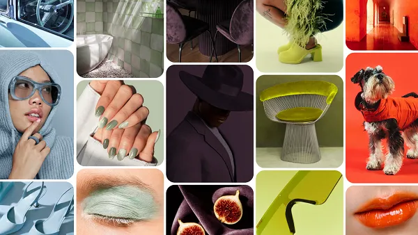
Pinterest’s 2026 “Pinterest Palette” report distills user interaction data over the past year to spotlight five colors poised to influence trends and engagement across platforms. These tones—each carrying a unique emotional and aesthetic appeal—offer valuable insights for marketers and creators aiming to refine their visual branding and promotional efforts.
- Cool Blue: Represents fresh focus and calm, ideal for conveying clarity and reliability.
- Jade: Evokes serenity and balance, supporting grounded and soothing visual themes.
- Plum Noir: Carries mystery and depth, adding powerful, dramatic flair to designs.
- Wasabi: Embodies bold defiance and energy, perfect for making striking statements.
- Persimmon: Radiates unfiltered joy and warmth, creating inviting and optimistic atmospheres.
These colors are more than aesthetic choices; they represent “bold, imaginative detours” that resonate emotionally, offering escapism and optimism in visual storytelling. While brands with established palettes may not overhaul their color schemes, integrating these trending hues subtly can boost campaign relevance and discoverability.
Marketers should consider Pinterest’s insights as a guide to evolving visual preferences, using this palette to craft engaging content that captures attention in crowded social feeds and aligns with emerging audience interests.