Source: SparkToro by Rand Fishkin. Read the original article
TL;DR Summary of SparkToro’s Enhanced Data Visualization Features
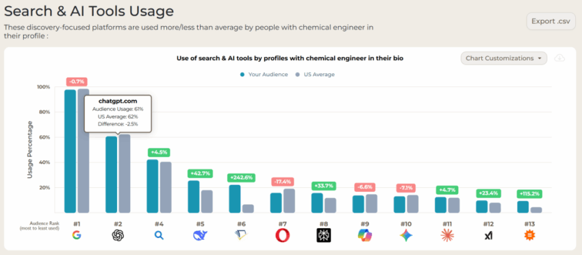
SparkToro has significantly upgraded its data visualization tools to display the exact audience percentages using various search engines, AI tools, and social networks. The new graph replaces the previous country-average comparison with detailed, user-requested metrics. Additionally, users can now customize charts easily by adding or removing platforms to better tailor their narratives. These improvements are part of ongoing quality-of-life updates aimed at enhancing user experience.
Optimixed’s Overview: SparkToro’s New Visualization Empowers Precise Audience Insights
Introduction to the Upgrade
SparkToro has upgraded its data visualization capabilities to better meet user needs by providing more precise and actionable audience data. Instead of a generic comparison against country-level averages, the new visualizations reveal the exact percentage of your target audience engaging with specific search engines, AI tools, and social networks.
Key Features of the New Visualization
- Accurate Audience Metrics: Shows detailed usage percentages rather than broad averages.
- Chart Customization: Allows users to add or remove platforms quickly to tailor visualizations for specific storytelling purposes.
- Ease of Use: Enhancements maintain simplicity, enabling quick adjustments with just a few clicks.
Benefits for Marketers and Analysts
With these updates, marketers and data analysts can:
- Gain clearer insights into audience preferences across multiple platforms.
- Create more targeted and compelling narratives based on accurate data.
- Save time by customizing visualizations without complex steps.
Looking Ahead
SparkToro continues to focus on quality-of-life improvements, promising additional enhancements to further refine data accessibility and visualization tools. User feedback remains a key part of this iterative process, ensuring the platform evolves according to audience demands.